Death by PowerPoint: Why Text-Heavy Slides Fail, According to Research
Death by PowerPoint explained: why slides full of bullet text lose audiences, what learning experiments and the 2003 Columbia report found, and what to do.

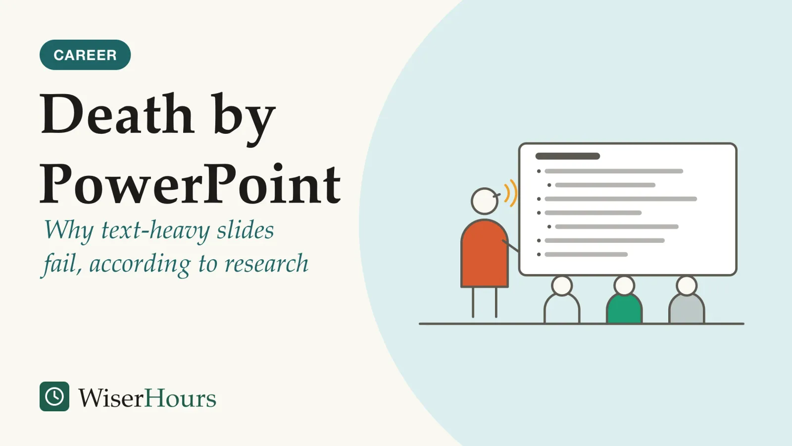
Engineers at NASA had studied whether a chunk of foam that hit the space shuttle Columbia’s wing at launch could have done serious damage. They briefed managers with slides, and on one of them the most alarming fact sat near the bottom, under a confusing title and several levels of bullets. The investigation board later said a senior manager could read that slide without realizing it described a life-threatening situation.1 On 1 February 2003, Columbia broke apart as it re-entered the atmosphere, and all seven astronauts on board died.2
Few decks carry stakes like that, but most fail the same way. Death by PowerPoint is the boredom and confusion an audience feels when a talk is a run of slides packed with text. Text-heavy slides fail because reading a paragraph and listening to you at the same time compete for the audience’s attention: the reading pulls attention away from the speaker, and the one point that matters gets lost among the rest. The fix is to give each slide one point, a short headline sentence and a picture that supports what you say, and to move the detail into a handout.
For nerves, structure and rehearsal, start with the public speaking guide for beginners.
What does death by PowerPoint mean?
Death by PowerPoint is an informal name for the boredom or disengagement audiences feel from poorly designed or wordy presentations, in any slide software. The phrase was in print by 2000, and the problem is older than the name: a 2000 training handbook said “death by overhead” had been replaced by death by PowerPoint.3
One of the best-known critics of slide decks is Edward Tufte, the Yale statistician and information designer. In a 2003 essay for Wired, he argued that the standard PowerPoint style puts format ahead of content and spreads so little information across each slide that audiences endure a “relentless sequentiality” of slides. He estimated that a typical business slide shows about 40 words, roughly eight seconds of silent reading, so a talk needs many slides, and with information stacked in time the audience struggles to see context and relationships.4 Tufte’s argument is expert opinion built from worked examples, not experiments, and he did not blame the software alone: he called PowerPoint a competent slide manager and said audience boredom is usually a content failure.
Anyone who sits through weekly status meetings has seen Tufte’s complaint: a dozen slides, each titled with a topic such as “Marketing update” and filled with five bullets, and by the fourth slide nobody is trying to connect them. Tidier slides cannot rescue a talk with no argument, so before you open the software, write one sentence saying what you want the audience to conclude, and build the deck around it.
Why are text-heavy slides bad? Reading and listening compete
Text-heavy slides are bad because they ask the audience to take in the same words twice, through the eyes and the ears, and the two streams get in each other’s way. In two experiments published in 2001 by a team at the University of California, Santa Barbara, in the US, adding on-screen text that repeated a narration lowered what students remembered and understood. Researchers call this the redundancy effect.5
The study
Mixed evidence
Mayer, Heiser and Lonn (2001): a lightning lesson that worked better without on-screen text
College students watched a short animation explaining how lightning forms while listening to a narration. In the first two of four experiments, students who also saw on-screen text that summarized or duplicated the narration did worse on tests of retention and of transfer, meaning using the ideas to solve new problems, than students who saw no on-screen text.5
Mayer’s team explains the result with a dual-channel theory: people take in what they see and what they hear through separate channels, and on-screen text can overload the visual one. Printed text and an animation both arrive through the eyes, so the learner has to split visual attention between them.5 The evidence is labelled mixed because later reviews disagree on how far the effect reaches (see the section on what the research does not show), and only the abstract of this paper was read for this article.
Slava Kalyuga and two colleagues at UNSW Sydney in Australia found the same pattern with spoken and written text alone. Across three experiments with 25 technical apprentices, the third showed that hearing and reading identical text at the same time, with no diagram, was less efficient than hearing it only. In the first two, when written and spoken explanations of a diagram came one after the other instead of together, learners reported less mental load and scored better on tests, as long as instruction time was limited.6 In the authors’ account, keeping two copies of the same text lined up overloads working memoryworking memory: The small mental workspace that holds and handles the information you are using right now, such as a phone number you are about to dial. Its capacity is limited, which is why juggling several things at once quickly overloads it.Full entry in the glossary, which holds whatever you are attending to at that moment and has little room to spare. This was a small sample, and again only the abstract was read.
- Same words, twice: the slide repeats the speech, so eyes and ears compete for the same words
- A small box: working memory holds only a little at once, and the duplicate spills over
- Picture plus voice: the slide shows what the speech describes, so each lane carries something different
Schematic, not real data: the shapes show the idea, not any result.
A project update shows how this plays out. The slide lists six bullets about a delayed supplier, written as full sentences, and the presenter talks through them in slightly different words. Listeners try to match what they hear to what they read, lose the thread when the wording drifts, and remember neither version well. Cut the slide to “Supplier delay pushes launch to March” above a simple timeline, and the ears get the explanation while the eyes get the picture.
When you notice you are about to say the words on your slide, either cut the words from the slide or stop speaking while the audience reads them.
Your audience reads faster than you speak
Silent reading is faster than reading aloud, so an audience facing a full slide finishes before the speaker does. A 2019 meta-analysis by Marc Brysbaert at Ghent University in Belgium, pooling 190 studies, put the average adult’s silent reading rate for English non-fiction at about 240 words a minute, against about 180 words a minute for reading aloud.7
The gap explains a familiar scene. The slide goes up, everyone reads it to the end, and then they wait while you catch up, or switch to their email. If you then read it to them, you are telling them something they already know, in a voice that now sounds slow. Readers who have finished have little reason to keep listening, and readers who have not are reading instead of hearing you.
A short slide removes the race. “Supplier delay pushes launch to March” takes a second or two to read, and the audience is back with you for the explanation.
How the Columbia slide buried the warning
A well-documented case of a slide burying its most important information is the briefing slide singled out in 2003 by the Columbia Accident Investigation Board, the US panel that examined the loss of the shuttle. The board said that condensing engineering analysis onto slides inevitably loses information, and that placement and wording can misrepresent what matters most.1
The slide’s title, “Review of Test Data Indicates Conservatism for Tile Penetration”, was confusing, the board noted: the conservatism referred to the choice of test models, not to the predicted damage. The slide packed what could have been 11 simple sentences into six levels of hierarchy. Only near the bottom did it state the key fact: one estimate of the debris was 640 times larger than the data used to calibrate the damage model (later analysis put it at 400 times).1 Tufte, whose analysis the board reprinted, also counted five uses of “significant” or “significantly” on the slide, with meanings ranging from a minor test result to damage that would kill the crew.1
In this context, it is easy to understand how a senior manager might read this PowerPoint slide and not realize that it addresses a life-threatening situation.
The board went further, describing NASA’s endemic use of briefing slides in place of technical papers as an illustration of its problematic methods of technical communication.1 The board did not blame the accident on one slide: its chapter sets out many organizational causes.1 But the slide shows what a bullet outline does to an argument: it gives every line the same visual weight, so the reader must work out which fragment matters, and a hurried reader may never get to the bottom.
The same thing happens in ordinary meetings when the one risk that needs a decision sits as the fourth sub-bullet on slide nine. Put the finding in the headline, as a sentence, and put the evidence for it in a document people can read at their own pace.
Further reading
Presentation Zen: Simple Ideas on Presentation Design and Delivery
Shows how to build slides with a picture and a few words so the audience listens to you while you speak.
As an Amazon Associate WiserHours earns from qualifying purchases.
What the research does not show
Nothing in the learning research says slides are useless or that every word on screen hurts. The redundancy effect is contested, the experiments mostly tested students learning from short lessons, and some audiences are helped by printed or on-screen text, as reviews of the wider evidence show.
A 2022 overview of 29 reviews, led by Michael Noetel at the Australian Catholic University, summarized an earlier meta-analysismeta-analysis: A study that combines the results of earlier studies on the same question into one overall estimate. Pooling makes the estimate more precise, but it cannot repair the studies it pools: a meta-analysis of surveys is still survey evidence.Full entry in the glossary (2012) of verbal redundancy that found a small overall benefit: adding written words to spoken ones helped learning, while adding narration to written text did not.8 The overview’s authors suggest that key words on screen can help listeners connect terms to what is said, and that redundancy may be destructive mainly in very bad design, which they call “death by PowerPoint”, where matching speech to text takes so much effort that it overloads the listener.8 The findings fit together: Mayer’s experiments added text on top of an animation, where it competed with a picture, while the meta-analysis pooled 57 results across many kinds of material and settings.8
- Myth
- The research proves that slides should have no words at all.
- Fact
- On-screen text repeating the speech hurt learning in lab studies when it competed with a picture. With no picture, a few key words can help listeners follow.
Handouts carry what the slides should not. In two experiments by Elizabeth Marsh and Holli Sink at Duke University in the US, published in 2010, students who had printed copies of the lecture slides during a science lecture took fewer notes, and the handouts were linked to better performance on a final test in one experiment and to less study time needed in the other.9 Only the abstract was read, and these were students in lectures, but the result suggests that detail a listener needs to keep belongs on paper or in a file. A finance lead presenting next year’s budget can show one chart of the three biggest changes, talk through why they happened, and hand round the line-by-line table for people to study after the meeting.
We found no study testing a typical business deck against a lighter one on outcomes such as decisions made or budgets approved. Treat the findings as a well-supported guide from learning research, not a proven rule for every meeting.
How many words should be on a slide?
No study sets a right number of words per slide. The research points to a test instead: the audience should be able to read the whole slide in a second or two and then return to you, which means a short headline sentence and, at most, a few key words or labels.
A practical check is to read the slide aloud at a normal pace. If that takes longer than a breath or two, the audience will spend that time reading instead of listening. A sales update headed “Renewals fell in the north after the price change” passes that test. Add four bullets on causes, costs and options, and it fails: those bullets belong in what you say or in the handout. Layout, color and chart choices are covered in the principles of slide design for non-designers.
How do you avoid death by PowerPoint?
You avoid death by PowerPoint by giving the screen and your voice different jobs: the slide shows the point and a picture, you supply the explanation, and a handout carries the detail. Four changes follow from the research above, each aimed at one of the failures it describes.
- 1Slideone point, a sentence headline, a picture
- 2Voicethe explanation
- 3Handoutfigures, caveats, sources
1. Give each slide a single point
Decide the one thing the audience should take from the slide and cut the rest. A slide with three ideas makes listeners guess which one you mean, and the Columbia board found the same burying effect on NASA’s slide, where the key fact sat among lines of equal weight.1 Split a three-point slide into three slides, each with its own headline.
2. Write the headline as a short sentence
Replace a topic label such as “Supplier update” with the finding: “Supplier delay pushes launch to March”. A sentence tells the audience what to conclude even if they read nothing else, and it can be read in the second or two before you start speaking.
3. Show a picture or chart that supports what you say
Use the screen for what your voice cannot do: a timeline, a photo of the product, a chart with one bar highlighted. Hearing words while seeing a related picture is among the better-supported findings in multimedia research, with pooled effects from moderate to large.8 When no useful picture exists, a few key words will do, and your full wording stays in the speaker notes.
4. Move the detail to a handout
Tables of figures, caveats, sources and the full argument go into a document you share before or after the talk. Readers can take it at their own pace, which a slide that disappears at the next click never allows.
Deck check the night before
The bottom line
Text-heavy slides fail because the audience reads them instead of listening to you, and because a wall of bullets hides the one point that matters. Before your next talk, go through the deck and ask of each slide whether you are about to say what it already says; if you are, cut the words to a sentence headline and a picture, and put the rest in a handout.
Frequently asked questions
Is PowerPoint itself the cause of death by PowerPoint?
Mostly not. Edward Tufte's 2003 critique blamed the standard PowerPoint style for putting format ahead of content and spreading thin material across many slides, but he called PowerPoint a competent slide manager and projector. The learning experiments point the same way: the harm they found came from how the material was built, such as on-screen text repeating the narration, whatever the software.
Are bullet points always bad on a slide?
No. A short list of key words can help listeners follow a talk with no picture to show, according to a 2012 meta-analysis summarized in a 2022 overview of multimedia research. The trouble starts when bullets become the script: long sentences, nested levels and more items than you will discuss, which the audience then reads while you say the same words.
Should you share your slides before or after a talk?
The research is thin and comes from university lectures. In two US experiments by Elizabeth Marsh and Holli Sink, published in 2010, students who had printed copies of the slides during a science lecture took fewer notes, and in one of them scored better on a final test. That supports giving a handout early when the material is detailed and listeners need to keep it, with the detail in the handout rather than on screen.
Sources
- Report Volume I, Chapter 7: The Accident's Organizational Causes. Columbia Accident Investigation Board (2003). NASA and the Government Printing Office, Washington, DC, August 2003
- Space Shuttle Columbia disaster. Wikipedia, accessed November 2026
- death by PowerPoint. Wiktionary, accessed November 2026
- PowerPoint Is Evil. Tufte, E. R. (2003). Wired, 1 September 2003
- Cognitive constraints on multimedia learning: When presenting more material results in less understanding. Mayer, R. E., Heiser, J. & Lonn, S. (2001). Journal of Educational Psychology, 93(1), 187-198
- When redundant on-screen text in multimedia technical instruction can interfere with learning. Kalyuga, S., Chandler, P. & Sweller, J. (2004). Human Factors, 46(3), 567-581
- How many words do we read per minute? A review and meta-analysis of reading rate. Brysbaert, M. (2019). Journal of Memory and Language, 109, article 104047
- Multimedia Design for Learning: An Overview of Reviews With Meta-Meta-Analysis. Noetel, M., Griffith, S., Delaney, O., et al. (2022; online 2021). Review of Educational Research, 92(3), 413-454
- Access to handouts of presentation slides during lecture: Consequences for learning. Marsh, E. J. & Sink, H. E. (2010). Applied Cognitive Psychology, 24(5), 691-706
How we researched this
Searches of Crossref, OpenAlex, Europe PMC and the wider web in November 2026 sought experiments and reviews on redundant on-screen text, reading speed and slide use, plus the primary records of the Columbia case. Sources span 2001 to 2022. Most experiments tested students learning from short lessons, not professionals at work talks, and for three studies only the abstract was read, so their details are limited to what the abstracts state.
Keep reading
Slide Design for Non-Designers: The Basic Principles
Slide design for non-designers: 6 principles from learning research, from cutting decoration to labeling charts directly, and where the evidence is thin.
Table Topics: Practice Questions and Drills for Off-the-Cuff Speaking
Table Topics practice: how a one-to-two-minute turn is timed, 30 original questions sorted by type, and 4 timed drills for practicing alone or in a club.
Impromptu Speaking: Frameworks for Thinking on Your Feet
Impromptu speaking without rambling: 6 frameworks matched to real moments, a short spoken example of each, ways to buy time and a weekly practice drill.
Canva for Presentations: Strengths, Limits, and When to Use It
Canva for presentations: what it does well, where it falls short (offline, data, PowerPoint export), when to use it, and 7 steps to present without surprises.