Value-Stream Mapping: A Step-by-Step Guide With a Worked Example
Value stream mapping in 7 steps, worked through on an invoice-approval example, plus what reviews find and the step most published maps skip.

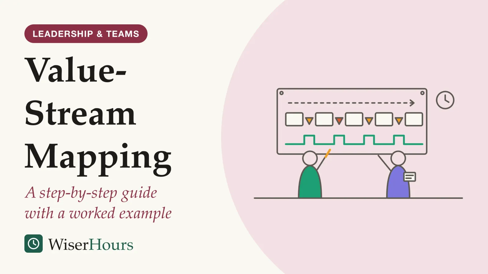
Value stream mapping answers one question about a slow process: where does the work sit and wait? You draw the whole process on one sheet, from the customer’s request to its delivery, with the information that sets each step moving and a timeline of working against waiting. In the illustrative invoice example worked through below, a supplier’s invoice spends about 16 working days in the system for about 25 minutes of actual work, and the map shows where those days go.
Mike Rother and John Shook set out the method in Learning to See, a Lean Enterprise Institute workbook that won a Shingo Research Prize in 1999: map the current state, find the waste, then draw a leaner future state and a plan to reach it.1 Its track record is promising but unproven: in a 2017 systematic reviewsystematic review: A review that fixes its question and its rules for including studies in advance, then searches out every study that fits and weighs them together. Some systematic reviews pool the results into a meta-analysis; others describe what the studies found without combining the numbers.Full entry in the glossary of value stream mapping in hospitals and care facilities, most studies linked it to shorter waits and stays, yet every one compared before with after, with no control group.2
The method comes down to seven steps:
- Choose one value stream and the customer it serves
- Walk the process and draw it by hand
- Add the information flow
- Put numbers on every step
- Draw the timeline and total it
- Design the future state
- Turn the future state into tested changes
What a value stream map shows that a flowchart does not
A value stream map puts two flows and a clock on one page: the work moving from step to step, the information that tells each step what to do next, and a timeline that sets waiting against working. The Lean Enterprise Institute, which publishes Learning to See, describes it as diagramming every step in the material and information flows needed to take a product from order to delivery.3
Value stream mapping, defined
Value stream mapping is drawing every step needed to take one product or service from order to delivery, with the information that triggers each step and the time each one spends working and waiting: first as it is, then as it should be.
Drawing the information flow is the feature that separates it from an ordinary process map, according to the publisher’s description of Learning to See.1 John Shook, the book’s co-author, compares a map without it to sheet music that lists the notes but not when to play them.4 In office work the comparison fits closely, because the information often is the process: an invoice sits untouched until an email tells someone it is their turn.
The idea comes from Lean. In Lean Thinking (1996), James Womack and Daniel Jones set out five principles: specify value as the customer sees it, identify the value stream, make the work flow, let the customer pull it and keep pursuing perfection; a value stream map is the second principle put on paper.5 For the wider practice it belongs to, start with an introduction to process improvement. A one-page SIPOC summary, covered by a separate guide planned in this category, can set the boundaries first.
The map’s first job is agreement. Dave LaHote, formerly president of Lean Education at the Lean Enterprise Institute, describes a team arguing in a conference room until a short walk along the line, notebook in hand, showed which step fell behind.6 It is one anecdote, but the lesson travels: when a team disagrees about a process, draw it together before debating the fix.
Value stream mapping, step by step, on one invoice process
Value stream mapping runs in a fixed order: scope, a current state drawn from observation, information and numbers, the timeline, then a tested future state. The running example is illustrative, not data from a real company: a finance team whose suppliers keep complaining about late payment.
1. Choose one value stream and the customer it serves
The Lean Enterprise Institute advises picking one product family, having one person lead the mapping, and capturing the whole flow from the door where work comes in to the door where it leaves.3 In an office, a “product family” is a type of request that follows the same steps: supplier invoices raised against a purchase order, say, rather than every payment the company makes.
Judy Worth, who has facilitated many mapping workshops in health care, adds two conditions: choose a value stream that matters to the organization’s goals, and agree up front where it starts and stops, so the team does not wander.7 For the example, write three things at the top of the sheet: the customer (the supplier waiting to be paid), the start (an invoice arrives) and the end (money leaves the account).
2. Walk the process and draw it by hand
Draw from what you see, not from the procedure manual: follow a few real items through every step and ask the person at each desk what gets in their way. The method’s co-author explains why drawing by hand matters:
The value in creating the drawings by hand is that it forces the drawer to go look, observe, and to try to really see what is going on at the value stream – not just individual process – level.
Bring the clerks and approvers who handle the item, and ideally those the process serves; Worth also recommends adding direct observation and interviews to spreadsheet data.7 Few published projects do the second part: a UK team’s 2021 systematic review of 105 published process-mapping studies in health care counted only about one in seven that reported involving patients or others who use the process.8 In the example, follow three real invoices and talk to the clerk, a budget holder, the finance manager and one supplier.
3. Add the information flow
Above the steps, draw how each one learns what to do next: emails, reminders, schedules, a shared inbox. In the example, suppliers email invoices to a shared inbox, the clerk forwards each one to a budget holder, the approval comes back as a reply, and a weekly payment run collects whatever is approved. Nothing tells the budget holder which invoice is close to its due date. That missing signal, not anyone’s effort, is why invoices sit.
4. Put numbers on every step
Under each step, add a small data box. The Lean Enterprise Institute’s list includes cycle time (work per item), lead time and percent complete and accurate (the share passed on with nothing missing or wrong).3 For office work, three are enough: minutes of work, waiting before the step, and the share right the first time.
Time real items rather than asking people to estimate; Worth suggests using existing systems where you can and measuring by hand at the start if you must.7 Here is the example’s current state.
| Step (illustrative) | Work per invoice | Waiting before the step | Right first time |
|---|---|---|---|
| Log the invoice from the shared inbox | 5 min | 2 days | 90% |
| Match it to the purchase order | 10 min | 1 day | 70% |
| Budget holder approves | 3 min | 6 days | 85% |
| Finance manager signs off | 2 min | 3 days | 95% |
| Weekly payment run | 5 min | 4 days | 98% |
5. Draw the timeline and total it
Under the steps, draw a stepped line: raised for waiting, low for work. Rother and Shook’s version of the method builds this timeline into the map so that value-adding and non-value-adding time sit side by side.9 Then add up each column.
- Information flow: how each step learns what to do next: here, forwarded emails and reminders
- Steps and queues: each box is a step where someone works on the invoice; each triangle is invoices waiting. The big one sits before approval
- Timeline: raised segments are waiting, low segments are work. Add each row to compare total lead time with total work time
Adding up the columns gives the totals quoted at the start, about 16 working days of lead time for about 25 minutes of work, and multiplying the right-first-time shares shows that only about half of invoices pass every step without being sent back. Work time divided by lead time is called flow efficiency; this category will cover it in its own guide. The map now tells you where to push: the longest bar on the timeline is the wait before approval, so speeding up the clerk would barely move the total.
6. Design the future state
Draw the process as it should run, then list what has to change to get there. Shook adds a caution: look for a better flow within the existing setup and try ideas that cost nothing before spending money.4
For the example, three changes follow from the map. Suppliers must quote a purchase-order number, which should lift the matching step’s first-time rate. Invoices that match an approved order within tolerance skip the budget holder, whose approval was given when the order was raised, and only mismatches go to a shared queue the approvers clear daily. The payment run moves to twice a week. On paper, most invoices would then get through in about 3 working days. That figure is a target to test, not a result. Software comes after this redesign; the guide to what workflow automation can and cannot do covers that choice.
7. Turn the future state into tested changes
Break the future state into small changes, each with an owner, a date and a measure. Worth suggests starting quick learning cycles within two to three weeks of the mapping session and testing every proposed solution before it is rolled out.7 In the example, trial the matched-invoice route with one group of suppliers for a month, record lead time weekly, then redraw the map.
When a change works, write the new steps down as a standard operating procedure so the next person follows them. When a step keeps failing for reasons the map cannot show, a root cause analysis is the next tool.
Before you pin up your first map
Does a value stream map make the work faster?
Value stream mapping is widely used and weakly tested. A 2017 review by Shou and colleagues, a team based in Australia, analysed published applications in manufacturing, health care, construction, product development and services; its abstract, all we could access, names understanding value and waste in varied settings, and fitting traditional lean metrics to each kind of flow, as central to developing the method.10 The outcome evidence below comes from health care, where we found a systematic review that rated each study’s risk of bias.
The study
Limited evidence
22 care projects, mapped and measured, and not one control group
Nowak, Pfaff and Karbach, at Germany’s University of Cologne, kept only projects that ran the full method, from current-state map to a measured future state. Among the 11 studies that tested their results statistically, seven of the eight that measured waiting and other non-value-added time reported a significant reduction, and seven of the nine that measured length of stay or total processing time did too. No study met every risk-of-bias criterion.2
The measures that moved were about time, which is what a map is built to expose. The caveat is design. Without a comparison group, any gain may come from something else that shifted in the same months, such as a new manager or a quieter season, and the authors conclude that a final judgment on effectiveness cannot yet be made.2
The published record is also one-sided. A 2021 scoping review of hospital and health-service applications from 2015 to 2019, by Juan Marin-Garcia and colleagues in Spain, found no article reporting negative or barely noticeable results, a sign of possible publication biaspublication bias: The tendency for studies with striking or statistically significant results to be published, while quieter ones stay in the drawer. Since the missing studies are mostly the unimpressive ones, a pooled result tends to overstate the effect until it is corrected.Full entry in the glossary. It also found that most maps stopped at the current state: of the 80 articles, a quarter drew no map at all, and two in three of those with a map had no future state.9 The authors’ point is blunt: mapping only the current state does not give an organization a route to improvement.
| Practice or claim | What the best evidence found | Evidence |
|---|---|---|
| Effect on waits and stays in care settings | Linked to shorter waiting time and length of stay | Systematic review of uncontrolled before-and-after studies, limited2 |
| Drawing a future state | Two in three published health-care maps had none | Scoping review of practice, not outcomes, limited9 |
| Involving the people the process serves | About one in seven health-care mapping studies reported it | Systematic review of practice, limited8 |
So judge your own map by your own numbers. Record lead time every week before and after a change, note what else changed in the meantime, and treat a vendor’s success story as a hypothesis until your own figures back it.
Mistakes that turn a map into wall art
Most value stream maps that go nowhere fail the same way: the team draws the current state, admires it and stops. The Lean Enterprise Institute says a perfectly drawn current-state map is not the point; drawing it is how a team comes to understand the flow, and the future state comes next.3 LaHote warns against spending days in software on maps fit for lamination.6
Keep it rough on purpose
Draw the first maps in pencil, date them, and redraw after each test instead of polishing one version.
Worth names three more. Mapping from spreadsheets alone misses what you only learn by watching the work. Mapping without a fixed start, end and scope achieves little. And jumping straight to isolated fixes can improve one part of the stream at the expense of the rest, which is why, for streams that cross departments, she asks all key stakeholders to agree on the future state first.7
If not, the map needs another walk along the process before it needs a nicer drawing.
The bottom line
A value stream map is worth drawing when a process is slow and nobody agrees why: walk it, draw it by hand, put times on it, and the long waits usually stand out from the short bursts of work. The evidence that mapping itself improves results is thin and one-sided, so the value lies in what you do next. Draw the future state, test one change at a time, and measure lead time before and after.
Frequently asked questions
How long does value stream mapping take?
Less than many teams expect for the first map. Dave LaHote of the Lean Enterprise Institute describes a team that usually spent two days on a map and drew a useful one in about 20 minutes by walking the line with pencil and paper. Judy Worth, writing for the Institute, suggests starting tests within two to three weeks of mapping, with 30-, 60- and 90-day plans.
Do you need software for value stream mapping?
No. John Shook, co-author of Learning to See, recommends drawing value stream maps by hand, because drawing forces you to go and look at the work. Software can help later to share a finished map or keep it current, but a pencil, a long sheet of paper and a walk along the process are enough to start.
Is value stream mapping only for factories?
No. A 2017 review by Shou and colleagues covered published applications in manufacturing, health care, construction, product development and services. Its abstract says that understanding value and waste in varied settings, and making sure traditional lean metrics suit each flow, are central to developing the method. The outcome reviews this guide relies on come from health care.
Sources
- Learning to See: Value-Stream Mapping to Create Value and Eliminate Muda. Rother, M. & Shook, J. (1998). Lean Enterprise Institute; publisher's book page, accessed 2026-09-27
- Does Value Stream Mapping affect the structure, process, and outcome quality in care facilities? A systematic review. Nowak, M., Pfaff, H. & Karbach, U. (2017). Systematic Reviews, 6, 170
- Value Stream Mapping. Lean Enterprise Institute, Lean Lexicon (online), accessed 2026-09-27
- Misunderstandings About Value Stream Mapping, Flow Analysis, and Takt Time. Shook, J. (2004). The Lean Post, Lean Enterprise Institute
- Lean Thinking and Practice. Lean Enterprise Institute, Lean Lexicon (online), adapted from Womack, J. P. & Jones, D. T. (1996), Lean Thinking; accessed 2026-09-27
- Keep It Simple: Value-Stream Mapping at the Gemba. LaHote, D. (2022, updated from 2014). The Lean Post, Lean Enterprise Institute
- 10 Tips for Getting the Most Value from Value-Stream Mapping. Worth, J. (2022, updated from 2015). The Lean Post, Lean Enterprise Institute
- Process mapping in healthcare: a systematic review. Antonacci, G., Lennox, L., Barlow, J., Evans, L. & Reed, J. (2021). BMC Health Services Research, 21, 342
- The Role of Value Stream Mapping in Healthcare Services: A Scoping Review. Marin-Garcia, J. A., Vidal-Carreras, P. I. & Garcia-Sabater, J. J. (2021). International Journal of Environmental Research and Public Health, 18(3), 951
- A cross-sector review on the use of value stream mapping. Shou, W., Wang, J., Wu, P., Wang, X. & Chong, H.-Y. (2017). International Journal of Production Research, 55(13), 3906-3928
How we researched this
Guidance comes from Learning to See's publisher page and Lean Enterprise Institute pages, including posts by the method's co-author and two practitioners. Evidence comes from reviews of value stream mapping found in OpenAlex, Crossref and Europe PMC searches run during September 2026, systematic reviews first. Sources date from 2004 to 2022. Main limitation: the outcome evidence used here comes from uncontrolled health-care studies, and one cross-sector review was available only as an abstract.
Keep reading
Root Cause Analysis Explained: Steps, Tools, and Common Mistakes
Root cause analysis step by step: the tools, why five whys falls short, and the fix teams skip. In one review, 2 of 21 studies could partly show a safety gain.
Six Sigma Explained for Beginners: What It Is and When It Fits
Six Sigma targets 3.4 defects per million chances, but its real content is a way to run projects. What it adds, what firm studies found, and where it fits.
What Is Process Improvement? A Plain-English Guide for Managers
Why does the same mistake keep happening? What process improvement means, the 4-step plan-do-study-act loop, and what makes the gains last.